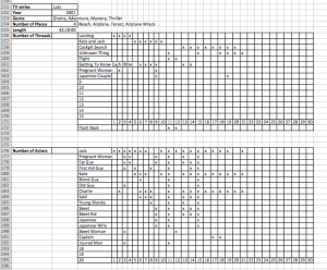
In the past 20 years, television storytelling has changed drastically. First we had traditional episodic and serial forms of television and then they turned into more complex narrative forms, changing our TV perception.  In our research project, we wanted to tackle this idea of narrative complexity in TV series. In the past years new techniques of directing and producing of motion pictures were introduced. Having that in mind, we wanted to find out if narrative complexity has changed over the last 20 years. Another thing we were thinking of is what factors would effectively influence narrative complexity in TV series. Since genre roughly classifies movies and TV series and therefore determines the form and style of TV series, our second research task was to discover if the narrative complexity varies based on the genre. In order to find out if there is a correlation between complexity of TV series and its popularity, we did a research to find out if more people tend to watch more complex and elaborate series, or if the majority prefers simple forms of entertainment, i.e. if they prefer a series that doesn’t require them to watch every single episode to understand it. In order to answer our research questions mentioned above, we chose 20 representative TV shows released in the last 20 years. With this selection, we also covered a wide range of genres. As the first episode usually represents the whole TV show very well, we decided to watch only the first episode of each series in order cover more series in the given time. To measure complexity, we focused on the following factors:  number of narrative threads, average number of narrative threads running in parallel, number of places as well as number of characters and average number of characters showing in the same time within an episode. By introducing a form, every team member followed given instructions and could work on his own in the data gathering. The form was filled out as shown in fig. 1, where the numbers for each time frame denote the thread number, in which that person appears.

Numbers indicate the presence of a character in a specific thread for every time frame.

Fig. 1: Data Gathering form for number of places, threads and actors. Numbers in the actors list indicate the presence of a character in a specific thread for every time frame.

Number of appearing flash backs and the consideration of different length of one episode was neglected on purpose not to have too many factors and facilitate the processing step. Given the data, we could determine the number of places, threads and actors in one episode. By dividing the actual number of threads and actors by the sum of all threads and actors for every series, we got the average number of threads and actors that run and appear at the same time, which gave us another two important factors to express narrative complexity. To make series comparable with each other, every factor is normalized by dividing it by the maximum of each column (eg. number of places is divided by the maximum value of all series). The complexity of each episode is then calculated as the sum of equally weighted factors (which could be optimized, but represent complexity very well). In order to address the third question, we used IMDB ratings and compared them with the calculated complexity.

Fig. 2: Number of places over time. Series released in the same year are averaged.

Fig. 2 shows the number of places of all series in dependence of time with an obvious upward trend over the last 20 years. With the black line representing the linear regression, it can be concluded, that the number of places increased approximately by 7 places over the last 20 years. However this has to be taken with a pinch of salt as the genre may have an important influence on the complexity.
asdfasdf

Fig. 3: Normalized and averaged complexity of all TV series over the last 20 years. Series released in the same year are averaged.

By plotting the averaged overall complexity of all series against time (fig. 3), the same trend is visible. The black line represents the linear regression of the data. Given these first results, we can confirm the tendency of an increase in narrative complexity in TV series over the past 20 years. To answer the second research question, we classified all 20 series into five genres. This classification has been carried out with consideration of online data bases as well as our own opinion.

Fig.4: Different genres and their corresponding complexity at the same time.

Fig.4: Different genres and their corresponding complexity at the same time.

We plotted four typical TV series representing four different genres (fig. 4), but that were released at the same time (between 2004 and 2005). The result shows, that sitcoms seem to have a low complexity in comparison to the other genres. By calculating the mean of all genres (even though we’ve seen before, the release date of a TV series seems to have an influence on the complexity) and the mean of all sitcom series, one obtains the graph in fig. 5.

asdfasdf

Fig. 5: Average complexity of the sitcom TV series (left) and all other genres (rest). The standard deviation is shown in black bars.

It can be concluded, that sitcoms show a less complex narrative style than other genres. This was expected and more or less obvious. But it also shows that our chosen process of data gathering and processing is right. Interestingly, sitcoms show the lowest standard deviation (black error bars) of all genres. This tells us, that sitcoms have not strongly changed in the last 20 years. Fig. 6 shows the averaged complexity values for all genres. Soap operas and action series show the highest complexity. It is to mention that these results may change considerably by using data of additional TV series.

Fig. 2: Normalized overall complexity of every genre.

Fig. 6:  Averaged, overall complexity of every genre.

To answer the last research question, the ratings of internet databases was compared with the complexity values for each series. For this, IMDB seemed to be the most appropriate data base, as there are thousands of people rating all kind of TV series. However, one has to keep in mind, that older TV series by trend show slightly lower values as not that many people know these series and new series seem to have a positive effect on the watcher.

Fig. 7: Averaged rating of all series of each genre

Fig. 7: Averaged rating of all series of each genre.

Fig. 7 shows the averaged ratings of all TV series per genre. Interestingly, the graph shows the same trend as the comparison of the genres by their averaged complexity. By plotting the complexity of each series against the rating in fig. 8, we observe a slight correlation, which is not outstanding though.

Fig. 8: Overall complexity of each series and their corresponding IMDB ratings.

Fig. 8: Overall complexity of each series and their corresponding IMDB ratings.

Finally we can conclude that narrative complexity in TV series increased over the past 20 years, complexity differs from genre to another and TV series with higher complexity tend to get higher ratings. In order to make more exact statements with certainty, further data gathering would be required and exceeds the available time of this project. The second part of our project was to visualize narrative complexity.  Two methods were chosen in that purpose: narrative threads and graphs showing interactions between characters. 

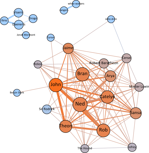
We felt that one of the most interesting aspects of a TV series are the characters, the way they develop, and most importantly, the connections that establish between them. Over a large number of episodes, viewers get familiar and even attached to the characters, this being one of the factors that keeps them hooked. We constructed a polymetric visualization of the characters in an episode in order to get an overview of the episode and its characters.  The size of the node is the weighted degree and the color of the node, the eigenvector centrality. We were inspired by the work done by the people behind moviegalaxies, and so we have contacted them do discuss their method; we’ve taken it and adapted it to our needs.

The important thing that this visualization brings is the fact that we are able to summarize a whole episode, one might argue that even a whole series, with just one picture. We see the interaction between characters, the clusters that are being formed. These clusters of characters are exactly the ones that are going to be the main protagonists in each narrative thread we have identified. In more complex TV series, such as Game of Thrones we can see that there are multiple clusters, in this particular case, they are not even connected; the characters don’t even meet for the entire series, they only know about each others existence and influence themselves indirectly.

game of thrones

Using this technique, we were able to spot patterns among different series, especially for sitcoms. For these, there is a small group of core characters and only one or two secondary characters which appear briefly and don’t have an impact on the plot. The graphs speak for themselves, showing the simplicity of the series (Big bang theory, Friends, How I met your mother and Two and a half men).

sit coms

Another notable observation can be made about Desperate Housewives: here we have a unique way of story telling by creator Marc Cherry. The story is always divided into 4 parts, one for each of the main protagonists (Bree, Gabrielle, Lynette and Susan), which later intertwine and evolve into a more complex plot. Besides their friendship, the common connection they share is the murdered Mary Alice, we can see, acts as the bridge between the three smaller clusters which represent their families. Because in this episode, Gabrielle and Bree were most of the time together, we see that their families form a single cluster. This later fact suggests one of the limitations of our approach: the data on which we are performing the analysis is sometimes too small. In the future, we plan to extend to a larger number of episodes for each series.

desperate housewives

Another pattern we see in a lot of TV series, especially, in the not so complex ones, is that of one main character and other secondary ones which gravitate around the first. He or she is the star of the show, present in all the narrative threads and connected with every other character.

1centric

Based on these findings we conclude that this visualization technique proved to be very useful. It allowed us to easily grasp a lot of information about all the 20 series and more importantly  it allowed us to compare them, to find similarities and recurring pasterns. We were able to see things that otherwise would have required complex statistical investigations and inspiration because, a picture is worth more than words. These graphs have helped set us on the right track and served as support during our statistical investigation.

We have also been able to identify some limitations of this technique and a couple of directions for further improvement. In some cases we were affected by the fact that we only analyzed one episode of each series. While we believe that each episode, especially the first one, is very representative for a successful TV series, one without a powerful motivation to change, we acknowledge the fact that there might still be some undiscovered or unrepresented connections between characters. For example, in the case of Oz, the main character in the episode, Dino Ortolani, dies and the subsequent episodes will have different main characters. This information couldn’t be uncovered through viewing only one episode. However, these type of cases are rare, and generally, the findings we’ve obtained are correct (validated through viewing more episodes of the series).

One of the directions of improvement would be to add a dynamic component to the visualization, specifically, to track the evolution of the graph over more episodes. In this way we can see the dynamics between the characters, the forming and breaking of relationships and how these evolve over time. This technique has been applied, with success, by the people behind movie galaxies, where they can see the evolution of characters within a movie. This helped identify various patterns, one of the most famous being the one of Quentin Tarantino who always kills a lot of his characters and new ones appear in the final part of the movie. We believe that applied in the context of TV series, this can provide even more interesting insights.

In our last update, we gathered the data about all the series and we were starting to try and analyze the complexity of each series in order to discover tendencies.

We now had comparable information about the number of threads, actors and places and furthermore averaged values for the number of threads and actors for every single series. The initial idea was now to find the weights of each of these 5 factors (all summing up to 1) in order to get a tangible complexity value for each series. Instead of this we normalized all the values for each factor (by dividing the given value by the maximum value of all series) and plotted diverse figures to recognize trends.

Normalized overall complexity in dependence of the release year.

Fig. 1: Normalized overall complexity in dependence of the release year. Releases from the same year are averaged and represent the same column.

Figure 1 shows the normalized overall complexity in dependence of the year, when the series was released. The black line shows the regression and highlights the increase in overall complexity.

Fig. 2: Normalized overall complexity of every genre.

Fig. 2: Normalized overall complexity of every genre. Black bars represent the standard deviation of each genre.

Fig. 2 on the other hand shows the averaged complexity of all series (from different years) of one genre. As expected, it shows that sitcoms have a lower narrative complexity than other genres. Another interesting fact is shown with the black error bars. While sitcom series do not differ a lot from each other in terms of complexity, science fiction series show big differences.

These first results show, that we follow a good and easily interpretable approach (which was our worry in the beginning). In the last weeks of the project, we will focus on the further analysis of these trends. By only plotting one factor (eg. the number of places), other tendencies can be recognized.

We had an intuition that the characters are worth a closer look and wanted to be able to build a social graph for each series and conduct some analysis on this in a second approach. We considered that two characters are connected if they appear on screen, in the same time, in the same narrative thread. The weight of a connection is given by the amount of time the two characters are appearing together.

This encoding allows us to quickly get a feel of how important a certain character is for a series through two ways: the weighted degree and the centrality. The first way shows how much time did the character was on screen in the episode, while the second measure gives a feeling of the importance of the character in the story that is being told, of how connected is the character to other participants. We’ve calculated the centrality based on the eigenvectors because we believe that a connection between character X and character Y is makes Y more important if X is a central character.

We have constructed visualizations for each series in order to be able to interpret the data visually using a poly metric view. The size of the node is the weighted degree and the color of the node, the eigenvector centrality. We were inspired by the work done by the people behind moviegalaxies, and so we have contacted them do discuss their method; we’ve taken it and adapted it to our needs. An example graph can be seen bellow, for Game of Thrones:

game of thrones

This is quite a complex tv series. We see that it has three clusters: a small one, formed only of 2 characters, a second one, centered around Daeneris and a large one, consisting of the main characters of the episode. John Snow is the most present character of the show, along with Ned Stark. However, because of the fact that he has more connection, John has a greater centrality than Ned. We can see that basically, almost everybody is connected to everybody. The main characters are the members of the Stark family, while the others gravitate around them: the Lanisters and other servants of house Stark.

Thus we see that through this visualization method, we can quickly get a feel of the episode and of what is going on.

If we were to choose a simpler series, for example sitcoms, we see that they all follow a simple pattern: a group of core characters, and one or two secondary characters which appear very briefly and don’t have an impact on the story. Even the graphs suggest the simplicity and linearity of the series.

sit coms

Finally, here is an overview of all the 20 series we have analyzed, showing the characters plotted based on their centrality.

characters

By playing with the data, we have found a couple of interesting facts, one of them being the following: the characters 33.3% of characters in sitcoms have a centrality of 1 and 80.56% have a centrality of over 0.8. If we look at the global numbers, we can see that 37.5% of the characters with centrality of 1 come from sitcoms. This is particularly interesting since out of the 20 shows, 5 are sitcoms and these have a smaller number of characters than the other genres. These leads us to the conclusion that the characters in sitcoms have a high centrality.

In the previous post about “Measuring and visualizing the increase in narrative complexity in TV series” project we talked about the preparation phase of data gathering. In order to answer our research questions, we had to choose carefully a set of series of different genres and the year of release.  As a tool for data gathering, we prepared excel sheets, which were explained in detail in the previous post.

As mentioned in the first update, the previous 4 weeks were devoted to data gathering.  Each member watched seven TV shows that were assigned to him/her in the first phase of the project. Complete data about genre, year of release, number of characters, places and story threads for all TV shows was recorded in a prepared excel sheet.

During the data gathering phase, we were also thinking what should be the best way to calculate and numerically express the complexity of each TV show.  As discussed in earlier blog posts, the number of places and characters and the story threads are relevant factors for those calculations. After analyzing other factors that could be also relevant, we came up with another two factors. The first one is the average number of characters appearing in one time frame (in our case, one time frame is 2 minutes of a TV show) and the second factor is the average number of active story threads in one time frame. Our decision to include two more factors for measuring complexity of TV show was based on the following conclusion: The bigger the value of mentioned factors, the TV show will be less easy for viewers to watch. Therefore the complexity will be higher.

After the identification of all important factors, the equation for calculating complexity was created: 0.2*number of threads per episode+0.2*number of actors per episode+0.2*average number of active threads in one time frame+0.2*average number of characters appearing in one time frame+0.2*number of places in one episode. Using this equation, complexity was calculated for every TV show. In order to prepare data for next project phase, we recorded calculated numbers for all TV shows in an excel table. In that way, it will be easier for us to analyze results and make conclusions. Before we move on to analysis of obtained results, we will have to find the right pre-factors that determine the weight of each complexity element, eg. the importance of each complexity element.

The data gathering phase was also useful for visualization of the narrative complexity. One visualization method (narrative threads) is already presented in prepared excel sheets used for data gathering.  Collected data about characters appearing in each time frame will help us develop the second visualization method, the character relationships graphs. In order to present correlations (if there are any) between complexity of a TV show and its genre or its year of release, we will add two more charts as visualization methods. With two different approaches, the results will be firstly more reliable and secondly better to understand.

Table with relevant  factors and calculated complexity for each TV Show

Table with relevant factors and calculated complexity for each TV Show

When it comes to the defined project plan, we can say that we’re still in time. According to the plan, we have one more week to finish all tasks related to data gathering and start with the next phase of the project.

Our next step of the project is the analysis of the gathered data. Secondly, the visualization approach with graphs that present relations between characters in TV series, will be completed for all TV series.

For the project preparation, main focus has been set on to our research questions. During the project, they should be our main objective and an overall aim.

In the first two weeks of the project, meetings have been set up to discuss and define the practical procedure of the data gathering in detail. These definitions are very crucial, so that data will be comparable independently of the person who analyzes a certain series. In order to achieve this, each step of the data gathering has been determined.

A prepared excel sheet has been set up, which all three team members will use in their individual work. The form (see fig. 1) consists of two tables with a vertical axis with either the different threads or all the roles appearing in the series. The horizontal axis stands for the time and is separated into frames of two minutes. This means that every second minute the current threads are analyzed and brought down to paper. As an additional complexity factor, flashbacks are recorded too. At the same time, all appearing major roles are listed. Furthermore, each member records all places that show up during the episode.

Evaluation sheet of a TV series, shown here: Lost from 2001

Fig. 1: Evaluation sheet of a TV series, shown here: “Lost” from 2001

Different series were chosen. We put emphasis on diversity in terms of the genre of the series as well on the time, when they were released. With the choice of 21 series, the different genres can be covered properly. Another thought we came up with was: If we will notice a tendency in the narrative complexity over the last 20 years (our first research question), it would not make sense to compare different genres at different times. To fix one variable, we would then analyze and compare additional series from the same time. For that reason we focused on the time dependence in the first part of the semester project.

The series were assigned to the member of the team that knows the series the best. This makes the data gathering more efficient, more accurate and more reproducible. By knowing already the story, it is much simpler to gather the specifically desired data, e.g. one knows which characters play a major role and which can be neglected.

We assume that the narrative style as well as the level of complexity does not change with the evolution of a series. The first episode is therefore meant to be representative for the entire series. Therefore it is even a prerequisite to have a certain level of knowledge about a series in order to interpret it well.

Independently of each other, we ran a test phase in the second week. As far as we could validate up to then, we were content and agreed on continuing the elaborated data gathering process.

Right according to the time plan, we started with the individual data gathering and kept in contact with each other to periodically discuss the ongoing progress of the project.

In a next step, we will converge all gathered data and start with the evaluation. According to the project calendar, we reckoned only two weeks for the processing and evaluation of the data. This seems very optimistic from the actual point of view. We will therefore take into account another week for this and start as soon as possible with the evaluation to be able to stick to the time plan.

Project proposal

Posted: December 19, 2012 by h0ria23 in Uncategorized

This project plan is an estimation of the milestones that will have to be achieved in the next spring semester, lasting from 18.2.2013 to 31.5.2013. The project will take 14 weeks of work and has to be finished by the end of the semester. Periodic meetings with the project adviser, Yannick Rochat, are considered in order to keep on track, to give important updates, to discuss issues and relevant questions and to set short term goals.

Week 1 to 2

  • Precise definition of the project approaches, including data gathering and storage
  • Running of the test phase, troubleshooting and adjustment of data mining procedure
  • Reproducibility check and optimization of procedure

Week 3 to 8

  • Implementation and realization of project, gathering of data and storage
  • Individual work with frequent meetings for update exchange and discussion

Week 9 to 11

  • Processing of gathered data
  • Transformation approach of stored data into visualization

Week 12 to 14

  • Answering of research questions
  • Evaluation of project and final conclusion

We believe that with time, the narrative of tv series has become of increasing complexity. This assumption will have to be verified and can be formulated with the question

Did narrative complexity increase over the last 20 years?

This would be the product of two factors: Firstly, the new techniques of directing and producing of motion pictures and secondly the fact that time has passed and people have more and more experience with motion pictures. We have seen a lot of movies that introduced new currents and new techniques (flash backs, multiple stories that appear disconnected but then they all converge, etc.), which were then imported into some of the later TV series. Thinking a bit further, we reach another important dilemma

Does the narrative complexity vary based on the genre of the series?

Our intuition tells us yes, and this is because of the fact that some genres are by definition very simple. Take sitcoms for example. Most of them have a very small number of characters, the plot is very simple (actually, there is no real plot most of the time). Seinfeld, one of the most successful sitcoms in TV history, is defined by its creator and main character as “a show about nothing”. There are very few places in which the action takes place and a probably more important fact is, that episodes are very rarely connected. A viewer can jump in at any time without missing anything.

On the other hand, series based on books (i.e. Game of Thrones) have a very long-lasting plot, every episode is continuing from where the other left of and a very common viewing pattern is to watch all the episodes of the series in a “marathon”.

A further question that we want to address is, whether there is a correlation between the complexity of a series and the number of viewers it has.

Do more people tend to watch more complex and elaborate series, or does the majority prefer simple forms of entertainment, a series that doesn’t require them to watch every single episode?

These three question will be the main focus of our group project in the next semester. See here, how we intend to answer these questions and read about the state of the art of this field.


As we’ve seen in the previous post, there are quite a few questions we want to address.

However, all the assumptions made must be validated or invalidated and for this we need to conduct a somewhat scientific research approach. For this, we must first choose representative series for each category. Thus, from the past, we will watch series like Twin Peaks, Black Adder, Beverly Hills, NYPD Blue, ER, all representative series for the late 80’s and early 90’s. From the present, we will turn our attention to series like Game of Thrones, Battlestar Galactica, Breaking Bad, Dexter, The Big Bang Theory, Desperate Housewives and Californication. Through this selection we have covered a wide range of genres: From sitcom to action series, to series that focus more on politics and to soap operas.

Now that we have defined what we will watch, we need a tool to measure, analyze and most importantly, be able to compare the narrative complexity. If one thinks about narration, he immediately connects it with narrative threads, the story that is being told. The more complex a narration is, the more different (possibly intersecting) narrative threads it has. Previously, we’ve mentioned flash backs. A flash back complicates things, because, firstly, it is no longer about one or more threads that go in parallel and secondly, these threads don’t even share the same time space anymore. Time continuity is no longer respected and after following a story in the present, the viewer is presented with something that takes place before everything. The complexity rises as the second thread reaches the beginning of the first.

The number of characters is another element we believe that has an impact on complexity. Even a single thread can be complicated when many characters participate in the action, because the viewer needs to keep track of a lot of things and make connections on the fly. Also, intuition tells us that with many characters, other narrative threads will spawn, but this remains to be seen during our analysis.

Lastly, another factor that plays a role in complexity is the location. The reasoning is similar to the one in the case of the number of characters. The more locations, the more complex the plot is. Many locations can imply that something takes place at each location, very possibly, concomitantly.

To summarize, our measure of complexity will be made up of the three factors, namely number of threads, characters and places.

To be more concrete, we must touch on how will we record this data. We will adopt the assumption that the characteristics of a TV series don’t change very much (possibly at all) during its lifetime. This assumption is intuitively true, if we think about how series are made: All of them start with a pilot episode, which is viewed by the network managers, who then decide whether to air the series or not. Also, once a certain viewer base is built, the series doesn’t change much, in order to keep its viewers. The case is different if the series is unsuccessful and must change in order to survive. However, we have chosen some of the most successful series of their time and genre, series that didn’t have the need to adapt and change.

It is because of all of these reasons that we will sample the series and only view the first episode of each the series. Here we will set another condition: All three of us, overall, have seen all the series. Thus we know the general plot, so we can see if the episode is relevant or not and admit if it is representative for the whole series. While watching, we will carefully take note of all the characters that appear, all the locations that are being presented to us and the moments of time during the episode at which they appear. Furthermore, we take note of each narrative thread that we identify and the time frame within it is presented to the viewer. Again, the fact that we have prior knowledge of the series helps, because some sequences of actions can be viewed as being part of a bigger thread. If there will be doubt, we know where the creator is going with the characters and the actions, respectively, so we can better classify it as a standalone thread or as part of something bigger.

After we have gathered all the data, we will build two different visualizations. One focused on the number of characters and another one focused on narrative threads. The first one is a graph, very similar to the one seen at movie galaxies showing each character and the connections and interactions to the others. We will identify clusters of characters and use the number of clusters inside the built metric to measure complexity. Many significant clusters will indicate a higher complexity than one single cluster with a large number of characters.

In order to view the narrative threads, we will use a very similar approach to Steven Johnson‘s approach presented in his book “Everything Bad is Good For You”. It shows a table of all the narrative threads and creates a column for each time interval. For every time interval each active thread (shown on screen) is marked at that time. Complexity will be based on the number of existing threads, the number of times the active thread is switched during an episode and the number of active threads at a same time interval. This well-defined data recording principle will be adopted for the number of characters and places. In order to avoid incomprehensible results and receive reproducible data, each team member will be responsible for one complexity measuring factor. This avoids differences in subjective deception and leads to better defined results. By merging all the data, each series can be analyzed in dependence of a complexity factor.

To answer the question of the people’s preferences regarding the narrative complexity in TV series, we will analyze the success of a TV series by comparison with data from movie and TV series forums, such as Rotten Tomatoes, imdb or Metacritic.

After measuring the complexity of each series we must turn to analyze it and see if our assumptions are validated or not. This remains to be seen during the next semester, but we feel very confident that we can conduct our experiment successfully.

To understand how to measure and visualize narrative complexity, let’s have a look at it’s meaning.

Growing complexity in TV involves multiple threading, social networks and flashing arrows.[1] Multiple threads in TV haven’t existed since ever, they first appeared in 1981 in ”Hill Street Blues”, an American serial police drama.[2] In comparison to an episode from an earlier decade, i.e. ”Starsky and Hutch” the structural transformation becomes obvious. Until then, there were always one to two major roles with a linear story and a resolution in the end. In Starsky and Hutch, the scheme is always the same, as the structure of an episode doesn’t change over the whole series. In Hill Street Blues however, the amount of threads within one episode suddenly increased, introducing several stories that were not solved by the end of the episode and referring to events from past episodes. This series marks the introduction of narrative complexity in TV series history. When it first was broadcasted, viewers perceived the show as too complicated and confusing.
Another interesting fact is the development of so called flashing arrows. While in the earlier stages every action was obviously indicated helping the viewer to understand every taken action, nowadays the film producer gives the viewer only small hints to understand the story.

Narrative complexity in TV series and TV in general is not new topic to researchers. Many people were exploring how television storytelling has changed and how does it influence viewers. That “new mode” of television storytelling is very well described in one of Jason Mittell’s books, “Complex TV: The Poetics of Contemporary Television Storytelling”.  Here author explains how traditional episodic and serial forms of television turned into more complex narrative forms, changing our TV perception.  As he states, many TV series have taken “novelistic” form, keeping us more engaged and addicted to a TV show. Narrative complexity increased to that level that new complex mode of TV narration can go unnoticed. The author also mentions many factors that impacted increase in narrative complexity. Some of them are writer’s role and media technology.  Using many TV series as examples, Jason Mittell present change of TV show beginnings and endings over time, complexity of characters and genre mixing in contemporary TV shows, viewer’s comprehension of new mode of television storytelling and many more things that explain how and why narrative complexity in TV shows increased.

Another great book related to increasing complexity of all kind of media (and TV’s complexity among others) is   “Everything Bad is Good for You: How Today’s Popular Culture is Actually Making Us Smarter” by Steven Johnson. Video games, movies, TV shows etc. get more complex over time, posing  us new cognitive challenges and making our minds sharper that way. More about this is described in Steven Johnson’s book. Similar to Janson Mittell’s approach, Steven uses many movies, games and TV series as examples to explain and present how that increasing complexity influences viewer’s perception.

There are also many blogs on this topic. The author of  “Narrative Complexity and Condensation” blog discusses narrative complexity and duration of TV shows’ episodes. He also discusses Steven Johnson’s book, the one which is mentioned before in this text. Another interesting blog is “How TV Met Narrative Sophistication”. Craig Jacobsen, the author of this blog, describes increasing narrative complexity through analysis of “Reunion”, “The Nine”, “24”, “The Office”, “Arrested development”, and “How I met you mother” TV shows. Many blogs present analysis of “Lost”, as an example of complex contemporary and narrative innovator TV show. Some of them are: “Lost in an Alternate Reality”, “Speculation on Spoilers: Lost Fandom, Narrative Consumption and Rethinking Textuality”, “Lost and Long-Term Television Narrative”, and “The Loss of Value (or the Value of Lost)”.

How to visualize narrative complexity?
For a viewer, an assessment on whether an episode or a tv series in general, has a complex narrative is fairly easy. He could look at the plot and see how many ramifications it has, does it continue from one episode to the other or even if various plot ramifications are concurrent. What if they intertwine? The reasoning is simple. However, what if someone who is new to the series wants to make an assessment on the narrative? Does he have to start watching the show?

One way for a new guy to do this would be to read the summary. This is not sufficient though, mainly because summaries are based on a whole season and not on one episode. But even if they were episode based, this wouldn’t be a very appealing mechanism. People are generally responsive to graphics, charts and other various visualizations of data. A specialist in data visualization, Santiago Ortiz, has created a very interesting project called Lostalgic. He is analyzing the popular series: “Lost” and he has created a very powerful way of visualizing the data.

At first, the user sees a lot of small rows, almost indistinguishable, however, he can navigate by season and then zoom in on a particular season, and later, on a particular episode. Each episode is split into acts and each act has one or more scenes (consisting of a couple of characters having a dialog). Each scene is represented as a sequence of character pictures and when the user hovers over the picture, he sees the line the character is saying. By ignoring the lines and looking only at the pictures, one can see what characters interact and how many scenes are in that particular episode. This view is great for seeing character interactions. One can see how many times two or more characters interact together and other interesting facts like this, facts that would be impossible to obtain by reading/watching the episodes. However, there are too many details which are not relevant for visualization and analysis of narrative complexity of a TV show.

Another way of visualization is found on Moviegalaxies website. Here, we visualize movies as graphs, each character in a movie being represented by a node. If two characters interact, then they are connected by a line. The main focus is on density and clustering. A node is as big as its degree and we see in how many clusters it appears. For example, a romance movie might have a small diameter and a high clustering coefficient, while a movie such as Babel (with a couple of separate stories) can have many small clusters that interact very rarely. In this way you can see what roles various characters play in the plot, you can derive that maybe a cluster is connected to a plot or various other things. Another very interesting analysis the two guys behind the project did was to investigate if there is a pattern for different movie directors (see graph below).

Chart with patterns for different movie directors

Chart with patterns for different movie directors

From this we see how the density evolves in time (it grows because some characters are killed and it decreases because new side stories are introduced to the viewer).

Narrative complexity of movies was also visualized by xkcd. They visualized movie’s story by character actions and interactions in following movies: “Lord of the Rings”, “Star Wars”, “Jurassic Park”, “12 Angry Man” and “Primer”. On their charts, every character in the movie is represented by one line. Additionally, they have one timeline to present characters’ actions in time (character’s first and last appearance and interactions with other characters). In those charts, grouping of the lines (which represent characters) indicates which characters are together in the same time. Names of stories in the movie are also shown in charts. Each story is placed in the charts in such way that it corresponds to the actual time of happening in the movie. In that way, overview of stories and characters participating is given. Even though xkcd’s visualization method (by showing stories, characters and their interactions) is interesting, charts sometimes look messy and might be difficult to follow.

Picture below shows xkcd’s way of visualizing narrative complexity in 4 analyzed movies.

xkcd's charts

xkcd’s charts

To conclude, narrative complexity has become more and more interesting to research and different approaches have been developed to measure and visualize it.